I’ve been using PRTG at work for a long time now, and recently started using the free tier at home for my own projects.
It works really well, but one of the things I found quite lacking was it’s ability to create dashboards. Sure, you have maps but there’s only so much you can do there, and they just don’t look all that good. Then I found this blog post on the PRTG blog about someone having written a PRTG data source provider for Grafana. Grafana is excellent a creating dashboards and drawing graphs, and what’s more, the end result looks good.
I set about giving it a try, and the results are pretty good so far.
I did find the installation documentation a bit lacking to start with, so here are my findings…
The install guide is on Github here along with the Grafana plugin.
-
The first stumbling block for me, was that you have to use the passhash and not password for your API user. To be fair, it does say that in the configuration wizard, I just couldn’t read. You can get the passhash from the
My Accountsection once you’re logged into PRTG. - Once that’s done, creating a dashboard couldn’t be easier.
- Create a new dashboard
- Add a panel of the type you want.
Graphmost likely. - Edit that panel, and in the
Metricssection select PRTG as yourdatasourceand then each of theGroup,Host,SensorandChannelfields will autopopulate with what’s in your PRTG installation. - Just select what you want from the list(s) and sit back and admire your graph.
-
Remember to save your dashboard after each change. This doesn’t happened automatically, and if you refresh the page you’ll loose your changes.
-
If you add new things to PRTG, then you might need to refresh the Grafana page completely before those things show up in Grafana.
- If you want a ‘status table’ showing you active Alarms in PRTG, for example, then you need to use the
Tablepanel type in Grafana. However, you should userawquery mode and reference the PRTG api directly.- Example, URI:
table.json, Query String:content=sensors&columns=device,sensor,status,message,downtimesince&filter_status=4&filter_status=5&filter_status=10. This will return all messages for Warning, Error and Unusual states. The filtering is done based on thefilter_statusoptions, the documentation for which I found here - If you dive into the
Column Stylesto color code the rows, I found I had to delete all existing rules, and create new ones before it would behave correctly.
- Example, URI:
- In the PRTG KB there is some more examples of getting started with the Grafana PRTG plugin. In many ways I found that documentation more useful than what was in the Github repo for the plugin.
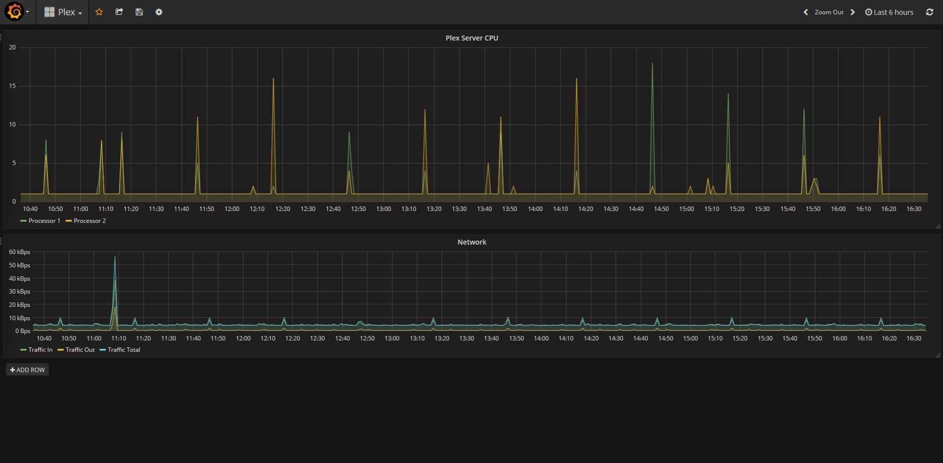
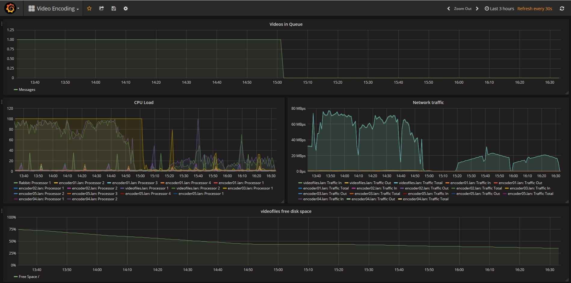
Finally, here are a couple screenshots of dashboards I created.